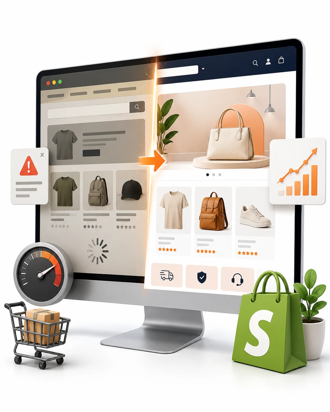
Your store can look perfectly fine and still leak sales every day. A Shopify Store Redesign is usually not about chasing a prettier theme, it is about fixing the friction that stops shoppers from buying, especially when mobile traffic is high, pages feel slow, or checkout keeps losing people at the finish line.
1. Start With the problem your store is already showing
A lot of stores wait for a dramatic crash before they redesign, but the warning signs are usually quieter than that. Maybe sales on mobile lag behind desktop, maybe product pages get clicks but not carts, or maybe shoppers vanish right before checkout.
That is the real signal. A redesign is not a makeover for its own sake, it is a response to a store that looks presentable but performs like a leaky bucket. If you can point to one or two places where shoppers consistently stall, you already have a strong case for change.
2. Your conversion rate is stuck below your category benchmark
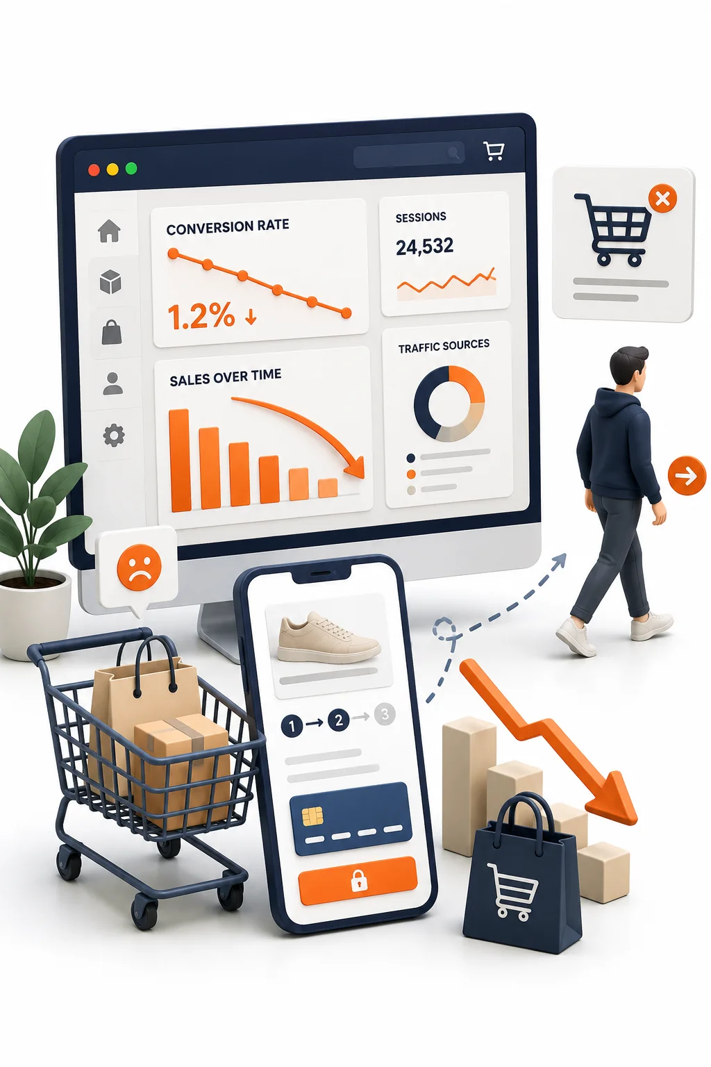
Conversion rate is just the share of sessions that end in a purchase. Sessions-based tracking is the standard way to compare performance, which matters because user-based numbers can tell a different story.
For Shopify stores, the average can sit around 1.4%, with top stores moving well above that. The catch is that category benchmarks vary a lot, fashion behaves differently from jewelry, and home decor is not the same as beauty. If your store is sitting well below the right peer group, a redesign is not vanity, it is overdue.
3. Mobile shoppers are doing the heavy lifting, but not buying
Mobile usually drives most visits now, which makes weak mobile performance painful fast. If your traffic comes mostly from phones but the sales are still coming from desktop, your store is basically asking people to work too hard with one thumb.
A redesign should make the phone experience feel obvious: tap-friendly navigation, sticky add-to-cart buttons, cleaner product pages, and a checkout that does not turn into a pinball machine.
Shopify data points to slow mobile pages as a common source of friction, and mobile speed is one of those things people notice even when they do not know they noticed it. If a product page lags during a coffee break scroll, the sale is gone.
4. Your homepage is busy, confusing, or trying to do too much
A homepage that shouts five messages at once is like walking into a cluttered aisle where every shelf is screaming for attention. Nothing wins, so nothing gets clicked.
Your first screen above the fold should answer one question immediately: what do you sell, and why should anyone care? Shopify recommends clarifying the value proposition on the homepage and product pages, and that advice still holds because first-time visitors do not have patience for detective work. A cleaner hierarchy, fewer competing promos, and stronger paths into collections usually beat a busy homepage every time.
5. Product pages are not answering the questions shoppers actually ask
Most product page problems are simple, which is why they are so expensive. The photos are pretty, but the sizing is vague. The copy sounds nice, but not useful. Shipping, fit, ingredients, or materials are buried where no one sees them.
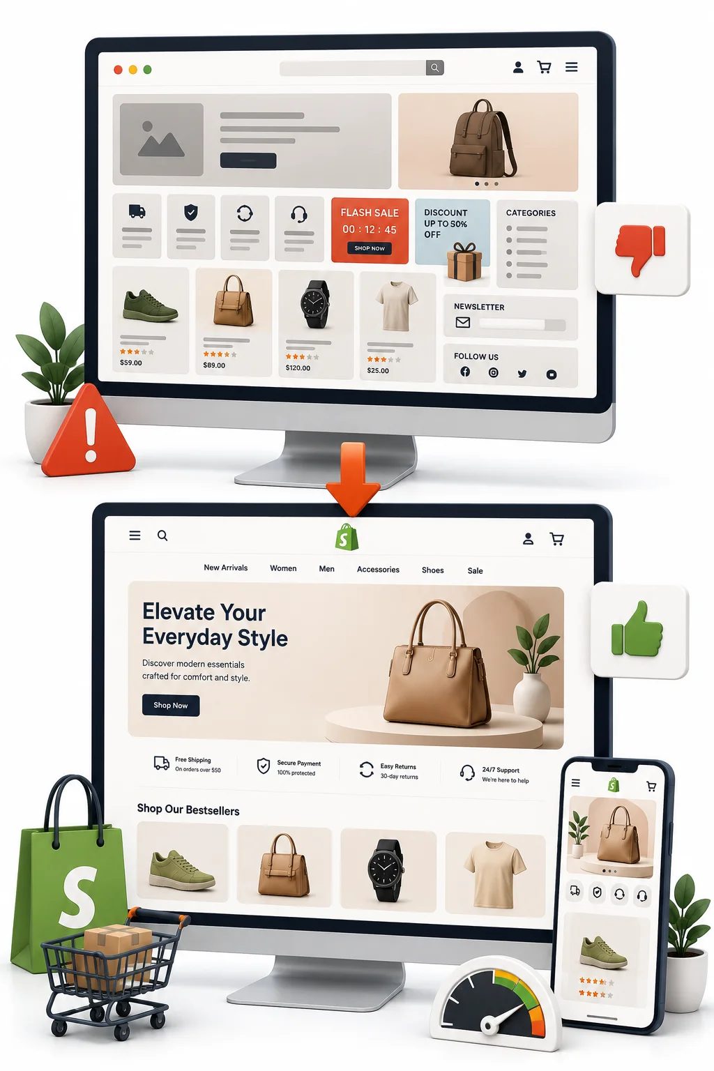
For fashion, beauty, jewelry, and home decor, product pages have to help people decide quickly. That means clear images, real-world context, reviews, delivery details, and trust signals where the eye naturally lands. A Shopify UX design that answers objections before they become doubts will always outperform a page that is just attractive.
6. Add-to-cart looks okay, but checkout is where money disappears
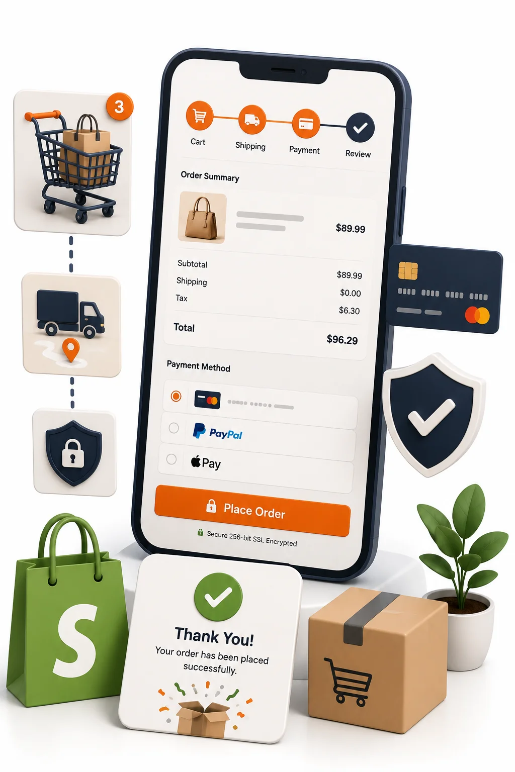
Here is where the numbers tell on you. If shoppers add products but do not finish the purchase, the issue is not interest, it is friction. Surprise shipping costs, too many form fields, weak payment options, or a guest checkout that is too hard to find can all kill the sale.
Shopify’s own guidance is blunt about checkout: keep it short, show shipping and delivery details upfront, and make guest checkout easy. That is not a design preference, it is lost revenue. If cart behavior looks healthy but checkout completion is weak, a Shopify store redesign should start there.
7. Your site feels slow, heavy, or awkward on key pages
Speed is not a technical nicety. It is part of the shopping experience. Large images, too many apps, bloated theme code, and layout shifts can make even a good-looking store feel clumsy.
The annoying part is that shoppers rarely complain about speed, they just leave. Research cited by Shopify links a small mobile speed improvement to a meaningful lift in conversion, which is why performance optimization should sit near the top of any redesign plan. If your collection pages drag or your product pages feel heavy, the theme is already costing you money.
8. Your branding no longer matches what your customers expect
A store can outgrow its design without feeling obviously outdated. The colors may still work, but the typography feels cheap. The imagery may be clean, but not premium. The overall look says “starter store” when the brand has moved on.
That mismatch matters. A Shopify store makeover should reinforce the price point and customer expectation, not quietly undercut it. If your products are better than the site makes them look, shoppers will feel that gap in seconds.
9. Your merchandising and navigation make products hard to find
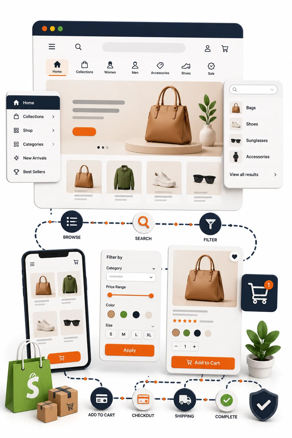
When shoppers have to hunt, they do not browse, they bail. Too many menu labels, messy collections, weak filters, and a search bar that does not help can turn a store into a stockroom with bad signs.
Good merchandising is invisible. The best Shopify theme redesigns make it easy to move from broad intent to a specific product in two or three clicks. If your catalog has grown and the navigation still reflects last year’s structure, the store is working against its own inventory.
10. Your content and visuals are not doing enough to build trust
Trust is built in the places people hesitate most, product pages, cart pages, and checkout. That is where reviews, secure checkout indicators, recognizable payment options, shipping policies, and return details earn their keep.
For DTC brands, this is especially important because shoppers cannot touch the product first. If you sell skincare, a handbag, or a sofa, the store needs to feel reassuring before the buyer ever reaches the payment step. A redesign should bake trust into the layout, not tack it on as an afterthought.

11. Your store is not set up for growth, apps, or new campaigns
Sometimes the problem is not what the store looks like today, it is what it cannot do tomorrow. Maybe new landing pages take forever to build, bundles are awkward, a quiz app clashes with the theme, or seasonal campaign pages need custom work every single time.
That is when Shopify custom design starts to make sense. If marketing wants flexibility and the current structure fights every change, a redesign can give you cleaner templates, less app chaos, and faster campaign launches. A Shopify developer or Shopify design agency can help here, but only if the foundation is rebuilt for growth instead of patched around.
12. You are replatforming, rebranding, or changing your business model
Big business changes almost always call for a redesign. New product lines, a premium repositioning, wholesale expansion, or a move from startup energy to a more established brand all need the site to tell a different story.
This is where a Shopify redesign company becomes useful, because strategy, content, and UX have to line up before launch. A redesign tied to a new business model should feel deliberate, not like a coat of paint over the same old structure.
13. You keep making small fixes, but the same problems keep coming back
If every fix is temporary, the real issue is deeper than the section you touched. You replace the hero banner, the homepage improves for a week, then sales flatten again. You tweak the cart, but abandonment stays high.
That pattern usually means the theme, page structure, or customer flow is the problem. A full Shopify website redesign is worth considering when patching one area at a time no longer changes the outcome. Honestly, that is often the moment stores have outgrown their original setup.


14. You do not have a clear testing or analytics setup
Redesigning blind is a good way to spend money twice. Shopify Analytics, GA4, and heatmaps show where shoppers click, scroll, hesitate, and leave. That data tells you whether the leak is on product pages, in the cart, or inside checkout.
Shopify also recommends using tools like heatmaps to guide redesign choices instead of guessing. The goal is simple: fix the weakest step first, not the prettiest one. If you do not know where people drop off, the redesign will be based on vibes, and vibes do not pay the bills.
15. You want a cleaner path from first visit to first purchase
This is the sign that matters most. If your store feels harder to buy from than it should, you already know a redesign belongs on the table.
A well-planned Shopify Store Redesign improves clarity, speed, trust, and checkout flow, which is exactly what shoppers feel even if they never name it. Start with the biggest friction point, maybe mobile navigation, maybe product pages, maybe checkout fields, and fix that first. Once one block disappears, the rest of the path gets a lot easier.